HeartShare Training
BRAND STYLE GUIDE | BUSINESS CARDS | FLYER | POSTER
HeartShare Training is a CPR training company that recently rebranded and needed help to pull it all together into a brand style guide. Additionally, they needed marketing materials created with the new brand look.
BRAND STYLE GUIDE
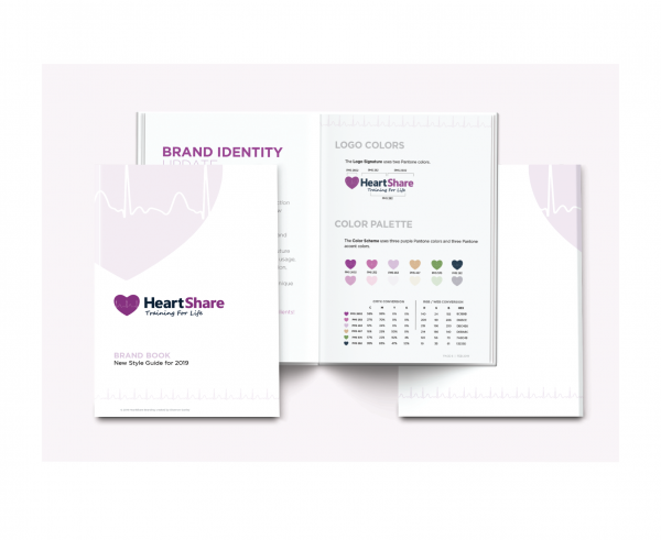
The first step was to create a cohesive brand style guide to handle the company’s recent rebrand. The logo spacing needed to slightly be adjustedand the color scheme was created to enhance new print collateral and future advertisements.
BUSINESS CARD
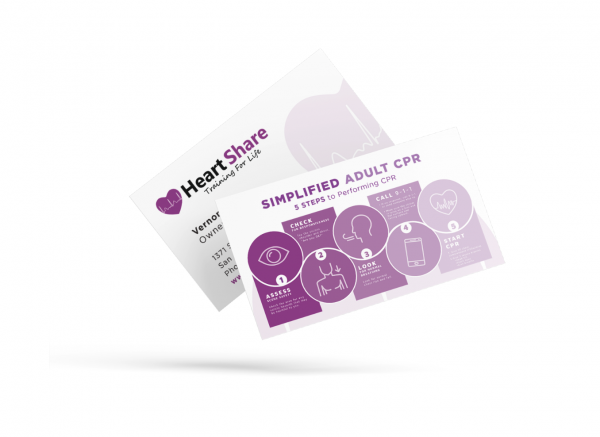
After finalizing the new color palette and typography, it was time to refresh the business cards. They were redesigned with custom icons to make the CPR process easy and clear to understand.
STATIONERY SET
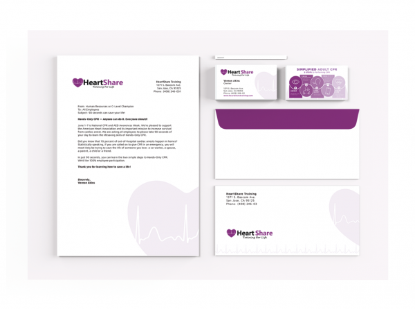
This personalized communication ties all brand materials together giving the company their professional edge.
PRINT DESIGN
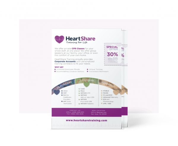
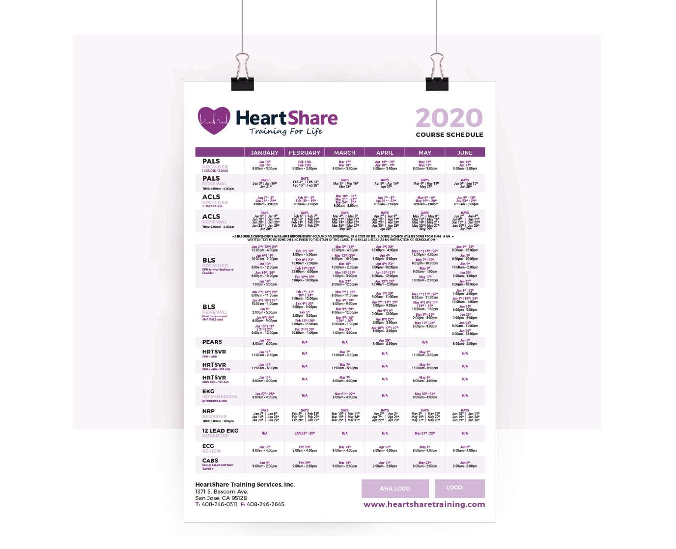
A flyer was designed to sign on more corporate dental accounts. The poster was designed for the upcoming 2020 class schedule.
Resulting in flexible, portable pieces of printed advertising that will be used to gain more customers, either as handouts or posters.

